Exploring ideas about how to make visualizations both more appealing and more functional.
Quarto
R
Author
Matt Babb
Published
May 5, 2025
Instructions
Create a Quarto file for ALL Lab 2 (no separate files for Parts 1 and 2).
Make sure your final file is carefully formatted, so that each analysis is clear and concise.
Be sure your knitted .html file shows all your source code, including any function definitions.
Part One: Identifying Bad Visualizations
If you happen to be bored and looking for a sensible chuckle, you should check out these Bad Visualisations. Looking through these is also a good exercise in cataloging what makes a visualization good or bad.
Dissecting a Bad Visualization
Below is an example of a less-than-ideal visualization from the collection linked above. It comes to us from data provided for the Wellcome Global Monitor 2018 report by the Gallup World Poll:
While there are certainly issues with this image, do your best to tell the story of this graph in words. That is, what is this graph telling you? What do you think the authors meant to convey with it?
It appears that this image is trying to represent the proportions of people in each country that answered affirmatively to the statement “Vaccines are safe”. That data come from the year 2018, and are grouped by global region. We can see that the median affirmative answer in each global region increases from the bottom of the plot to the top.
List the variables that appear to be displayed in this visualization. Hint: Variables refer to columns in the data.
Variables include:
Percentage of people who believe that vaccines are safe
Global region
Region medians
Countries
Now that you’re versed in the grammar of graphics (e.g., ggplot), list the aesthetics used and which variables are mapped to each.
The aesthetics map to variables in the following ways:
x is mapped to proportion of the population that believes that vaccines are safe
y is mapped to…nothing?
color is mapped to goblal region
label is mapped individual country names
Each point represents the proportion of a country’s pro-vacc’ers, and is drawn with geom_point()
Vertical lines are added using geom_vline() to show regional medians, which increase as one looks higher in the plot
What type of graph would you call this? Meaning, what geom would you use to produce this plot?
This appears to be a scatterplot that also creates a quasi-faceting effect by grouping countries based on region, and then separating them vertically depending on the median proportion of belief in vaccine safety in each global region. I would use geom_point() to create this plot.
Provide at least four problems or changes that would improve this graph. Please format your changes as bullet points!
Four ways to improve this plot are:
Eliminate the legend
Double-code the points to further distinguish them beyond color
Eliminate the appearance of the y-axis in each facet representing something quantitative
Make points clickable so that one can see percentages for individual countries
[Bonus] I would add a search bar so that someone can search for individual countries
Improve the visualization above by either re-creating it with the issues you identified fixed OR by creating a new visualization that you believe tells the same story better.
Code
wgm_agree <- wgm_clean %>%filter( Question =="Q25 Do you strongly or somewhat agree, strongly or somewhat disagree or neither agree nor disagree with the following statement? Vaccines are safe.", Response %in%c("Strongly agree", "Somewhat agree") ) %>%group_by(Country) %>%summarise(percent_agree =sum(`Column N %...4`, na.rm =TRUE) ) %>%arrange(desc(percent_agree))country_to_region <-unlist(lapply(names(region_map), function(region) {setNames(rep(region, length(region_map[[region]])), region_map[[region]])}))wgm_agree <- wgm_agree %>%mutate(Region = country_to_region[Country],Region =ifelse(is.na(Region), "Other/Unclassified", Region))
Code
library(plotly)library(ggplot2)library(dplyr)library(forcats)library(ggridges)library(crosstalk)library(bslib)library(htmltools)wgm_agree_filtered <- wgm_agree %>%filter(Region !="Unclassified") %>%mutate(Region =fct_reorder(Region, percent_agree, .fun = median))shared_data <- SharedData$new(wgm_agree_filtered)# Base plotp <-ggplot(shared_data, aes(x = percent_agree, y = Region, fill = Region)) +geom_density_ridges(scale =1.2, alpha =0.6, color ="white") +geom_point(aes(text =paste("Country:", Country, "<br>Score:",round(percent_agree *100, 1), "%")),position =position_jitter(height =0.1),size =2,color ="black" ) +scale_x_continuous(limits =c(0.2, 1.0),labels = scales::percent_format(accuracy =1) ) +labs(x ="Agreement",y =NULL ) +theme_minimal() +theme(plot.title =element_text(size =16, face ="bold"),legend.position ="none" )# Interactive plotplotly_obj <-ggplotly(p, tooltip ="text") %>%layout(title =list(text ="<b>Belief that Vaccines are Safe by Region</b>",x =0,xanchor ="left",y =0.95,yanchor ="top",font =list(size =20, family ="Arial", color ="black") ) )# Combine search bar and plot (stacked vertically)browsable(tagList(filter_select(id ="country",label ="Select Country",sharedData = shared_data,group =~Country), plotly_obj ))
For this second plot, you must select a plot that uses maps so you can demonstrate your proficiency with the leaflet package!
Select a data visualization in the report that you think could be improved. Be sure to cite both the page number and figure title. Do your best to tell the story of this graph in words. That is, what is this graph telling you? What do you think the authors meant to convey with it?
Original image (Source: Wellcome Global Monitor, 2018, p. 92.)
This plot intends to show the net percentages of people in each global region who believe that technology will lead to an increase in jobs within their country in the next five years. Global regions are listed, as well as an average for the world. Bars are colored to indicate positive or negative net increase, and a line at x = 0 is shown.
List the variables that appear to be displayed in this visualization.
Variables include:
Global regions
Net impact score of technology on jobs in the next five years (percentage of people who said “Increase” minus percentage of people who said “Decrease”)
Positive vs Negative net percentages (color coded as Yellow or Dark Blue)
Now that you’re versed in the grammar of graphics (ggplot), list the aesthetics used and which variables are specified for each.
x is mapped to net percentage of the population in the global region that believes that jobs will increase in the next five years due to technology
y is mapped to the global region
fill is mapped to whether the net percentage is positive or negative
What type of graph would you call this?
I wold call this a horizontal bar chart. I would use geom_bar() to create this plot.
List all of the problems or things you would improve about this graph.
This plot is already pretty reader friendly. And I will be turning it into a map. But if I were to keep it as a bar chart, the details I would change include:
Colorizing the description so that “Increase” is Yellow and “Decrease” is Dark Blue.
I would remove the percentage markers at the end of each bar and make the bars hoverable so there are fewer numbers on the page.
I would make the “World” bar a different color and more prominent. I actually missed that detail the first time I looked at it.
I would include fewer x-axis labels. Every unit of 5 does not need to be included if the bars are hoverable
Improve the visualization above by either re-creating it with the issues you identified fixed OR by creating a new visualization that you believe tells the same story better.
Agreement vs Disagreement that Technology Will Increase the Number of Jobs in My Country in the Next Five Years
Code
library(dplyr)library(tidyr)library(leaflet)library(rnaturalearth)library(rnaturalearthdata)library(sf)library(htmltools)# Pull just Q19 responsesq19_overall <- wgm_clean %>%filter(Question =="Q19 Overall, do you think that science and technology will increase or decrease the number of jobs in your local area in the next five years?") %>%select(Country, Response, OverallPercent =`Column N %...4`) %>%distinct() %>%pivot_wider(names_from = Response, values_from = OverallPercent)# Clean summary tableq19_final <- q19_overall %>%select(Country, Increase, Decrease) %>%mutate(Total = Increase - Decrease)# Get country centroidsworld <-ne_countries(scale ="medium", returnclass ="sf") %>%st_centroid()centroids <- world %>%select(Country = name_long, geometry) %>%st_coordinates() %>%as.data.frame() %>%bind_cols(Country = world$name_long)# Join coordinates to dataq19_geo <- q19_final %>%left_join(centroids, by ="Country") %>%filter(!is.na(X) &!is.na(Y))# Create diverging palettemax_val <-max(abs(q19_geo$Total))diverging_palette <-colorNumeric(palette =colorRampPalette(c("#440154", "#C7E9B4", "#5DC863"))(100),domain =c(-max_val *0.5, max_val))# Leaflet map (no search bar)leaflet(q19_geo) %>%addProviderTiles(providers$CartoDB.Positron) %>%addCircleMarkers(lng =~X,lat =~Y,radius =7,color =~diverging_palette(Total),stroke =TRUE,weight =1,opacity =1,fillOpacity =0.9,label =~Country,popup =~paste0("<strong>", Country, "</strong><br>","Net Agreement: ", round(Total *100, 1), "%" ) ) %>%addLegend("bottomright",pal = diverging_palette,values =~Total,title ="Net % Agreement",labFormat =labelFormat(suffix ="%", transform =function(x) 100* x),opacity =1 )
Third Data Visualization Improvement
For this third plot, you must use one of the other ggplot2 extension packages mentioned this week (e.g., gganimate, plotly, patchwork, cowplot).
Select a data visualization in the report that you think could be improved. Be sure to cite both the page number and figure title. Do your best to tell the story of this graph in words. That is, what is this graph telling you? What do you think the authors meant to convey with it?
Original image (Source: Wellcome Global Monitor, 2018, p. 98.)
religion_science_disagreement.jpg
This plot intends to show how people tend to resolve informational disputes between science and the beliefs of their religion. Respondents had the choice of selecting “science”, “the teachings of my religion”, or “it depends”. Response rates are grouped by answer choice and also by geographical region.
List the variables that appear to be displayed in this visualization.
Variables include:
Percentage of people who believe science, their religion, or “it depends” when faced with an informational conflict between the two
Global region
Color-coded bars so that different responses can be easily distinguished (colored Yellow for “Science”, Dark Blue for “Religion”, and Light Blue for “It depends”)
Now that you’re versed in the grammar of graphics (ggplot), list the aesthetics used and which variables are specified for each.
x is mapped to net percentage of the population in the global region that choose to believe either science, the teachings of their religion, or “it depends” when there is disagreement between them
y is mapped to the global region
fill is mapped to the response type
What type of graph would you call this?
I would call this a horizontal grouped bar plot. I would use geom_bar() to create this plot, with position = "dodge".
List all of the problems or things you would improve about this graph.
This plot is a little harder to look at than the previous one. Here are the changes I would make:
I would make the bars hoverable so that I can get rid of the copious percentages at the end of every bar.
I would eliminate the legend and code the colors into the title / subtitle
I would simplify the title
I would make the x-axis showing percentages for easy visual estimations, but I would have fewer grid lines
Improve the visualization above by either re-creating it with the issues you identified fixed OR by creating a new visualization that you believe tells the same story better.
Which are you more likely to believe when there is disagreement?
Code
library(dplyr)library(ggtext)# Step 1: Add region labels based on country nameswgm_clean <- wgm_clean %>%mutate(Region =case_when( Country %in%c("Kenya", "Tanzania", "Uganda", "Ethiopia", "Rwanda", "Burundi") ~"Eastern Africa", Country %in%c("Chad", "Cameroon", "Central African Republic", "Democratic Republic of the Congo") ~"Central Africa", Country %in%c("Algeria", "Morocco", "Tunisia", "Libya", "Egypt") ~"North Africa", Country %in%c("South Africa", "Namibia", "Botswana", "Zimbabwe", "Lesotho") ~"Southern Africa", Country %in%c("Nigeria", "Ghana", "Senegal", "Ivory Coast", "Sierra Leone") ~"Western Africa", Country %in%c("Mexico", "Guatemala", "Honduras", "Nicaragua", "Costa Rica", "Panama") ~"Central America & Mexico", Country %in%c("United States", "Canada") ~"Northern America", Country %in%c("Brazil", "Argentina", "Colombia", "Chile", "Peru", "Venezuela") ~"South America", Country %in%c("Kazakhstan", "Uzbekistan", "Kyrgyzstan", "Turkmenistan", "Tajikistan") ~"Central Asia", Country %in%c("China", "Japan", "South Korea", "Taiwan", "Mongolia") ~"East Asia", Country %in%c("Indonesia", "Thailand", "Vietnam", "Malaysia", "Philippines", "Myanmar") ~"Southeast Asia", Country %in%c("India", "Pakistan", "Bangladesh", "Nepal", "Sri Lanka") ~"South Asia", Country %in%c("Iran", "Iraq", "Saudi Arabia", "Turkey", "Jordan", "Lebanon", "Israel") ~"Middle East", Country %in%c("Russia", "Ukraine", "Poland", "Romania", "Bulgaria", "Hungary") ~"Eastern Europe", Country %in%c("United Kingdom", "Ireland", "Sweden", "Norway", "Denmark") ~"Northern Europe", Country %in%c("Italy", "Spain", "Greece", "Portugal") ~"Southern Europe", Country %in%c("France", "Germany", "Netherlands", "Belgium", "Switzerland", "Austria") ~"Western Europe", Country %in%c("Australia", "New Zealand") ~"Australia & New Zealand",TRUE~NA_character_ ))# Build region summary with only three meaningful responsesq30_region_summary <- wgm_clean %>%filter(Question =="Q30 (If respondent believes science has disagreed with teachings of religion) Generally speaking, when science disagrees with the teachings of your religion, what do you believe? Science or the teachings of your religion?") %>%filter(Response %in%c("Science","The teachings of your religion","(It depends)")) %>%filter(!is.na(Region)) %>%group_by(Region, Response) %>%summarise(n =sum(`Unweighted Count...5`, na.rm =TRUE), .groups ="drop") %>%group_by(Region) %>%mutate(Percent = n /sum(n) *100) %>%ungroup()# ✅ Recode labels to match fill colorsq30_region_summary <- q30_region_summary %>%mutate(Response =recode(Response,"The teachings of your religion"="Religion","(It depends)"="It depends" ))
Code
library(ggplot2)library(ggtext)library(plotly)# ggplot object with tooltip and custom stylingq30_hover_plot <-ggplot(q30_region_summary, aes(x = Region,y = Percent,fill = Response,text =paste0(Response, ": ", round(Percent, 1), "%") )) +geom_col(position ="dodge", width =0.75) +scale_y_continuous(breaks =seq(0, 75, by =12.5),labels =function(x) {ifelse(x %in%c(25, 50, 75), paste0(x, "%"), "") } ) +scale_fill_manual(values =c("Science"="#FFD700","It depends"="#00BFFF","Religion"="#002147" ) ) +labs(title =NULL, subtitle =NULL,x =NULL,y =NULL,fill =NULL ) +theme_minimal(base_size =14) +theme(axis.text.y =element_text(size =9),axis.text.x =element_text(size =9),legend.position ="none",plot.title =element_text(face ="bold", size =12),plot.subtitle =element_markdown(size =10),plot.title.position ="plot",panel.grid.major.y =element_blank(),panel.grid.minor.y =element_blank() ) +coord_flip()# Convert to interactive plot with custom title + subtitleggplotly(q30_hover_plot, tooltip ="text") %>%layout(margin =list(l =0, r =10, t =130, b =50),title =list(text =paste0("<span style='font-size:18px'><b>Which Are You More Likely to Believe When There is Disagreement?</b></span><br>","<span style='font-size:14px'>","<span style='color:#FFD700'><b>Science</b></span>, ","the <span style='color:#002147'><b>Teachings of Your Religion</b></span>, or ","<span style='color:#00BFFF'><b>It Depends</b></span>","</span>" ),x =0,xanchor ="left",yanchor ="top" ) )
Source Code
---title: "Advanced visualizations"description: "Exploring ideas about how to make visualizations both more appealing and more functional."author: - name: Matt Babbdate: 05-05-2025categories: [Quarto, R] # self-defined categoriesimage: preview-visualization.jpgdraft: false # setting this to `true` will prevent your post from appearing on your listing page until you're ready!editor: sourceembed-resources: trueecho: truewarning: falseerror: falsecode-fold: truecode-tools: true---# Instructions**Create a Quarto file for ALL Lab 2 (no separate files for Parts 1 and 2).**- Make sure your final file is carefully formatted, so that each analysis isclear and concise.- Be sure your knitted `.html` file shows **all** your source code, includingany function definitions. # Part One: Identifying Bad VisualizationsIf you happen to be bored and looking for a sensible chuckle, you should checkout these [Bad Visualisations](https://badvisualisations.tumblr.com/). Looking through these is also a good exercise in cataloging what makes a visualizationgood or bad. ## Dissecting a Bad VisualizationBelow is an example of a less-than-ideal visualization from the collectionlinked above. It comes to us from data provided for the [Wellcome Global Monitor 2018 report](https://wellcome.ac.uk/reports/wellcome-global-monitor/2018) by the Gallup World Poll: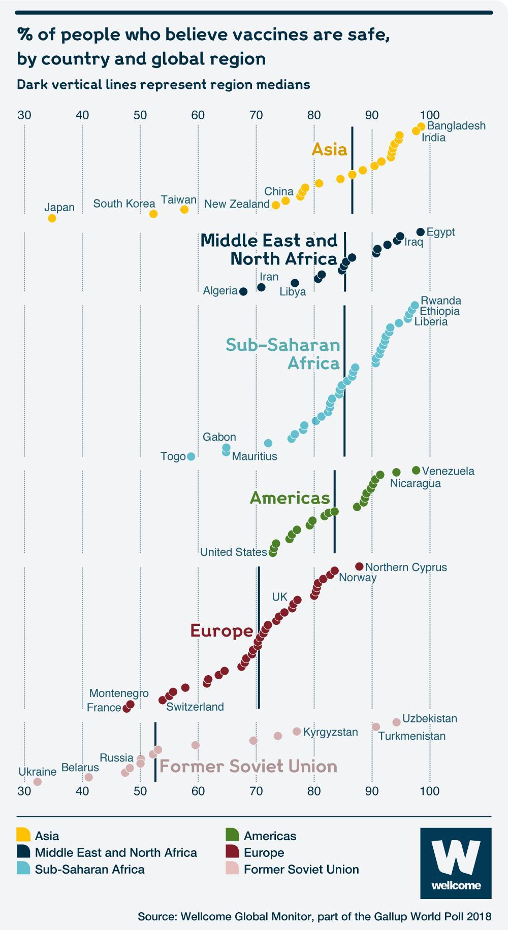1. While there are certainly issues with this image, do your best to tell thestory of this graph in words. That is, what is this graph telling you? What doyou think the authors meant to convey with it?It appears that this image is trying to represent the proportions of people in each country that answered affirmatively to the statement "Vaccines are safe". That data come from the year 2018, and are grouped by global region. We can see that the median affirmative answer in each global region increases from the bottom of the plot to the top.2. List the variables that appear to be displayed in this visualization. *Hint: Variables refer to columns in the data.*Variables include:- Percentage of people who believe that vaccines are safe- Global region- Region medians- Countries3. Now that you're versed in the grammar of graphics (e.g., `ggplot`), list the *aesthetics* used and which *variables* are mapped to each.The aesthetics map to variables in the following ways:- `x` is mapped to proportion of the population that believes that vaccines are safe- `y` is mapped to...nothing?- `color` is mapped to goblal region- `label` is mapped individual country names- Each point represents the proportion of a country's pro-vacc'ers, and is drawn with `geom_point()`- Vertical lines are added using `geom_vline()` to show regional medians, which increase as one looks higher in the plot4. What type of graph would you call this? Meaning, what `geom` would you useto produce this plot?This appears to be a scatterplot that also creates a quasi-faceting effect by grouping countries based on region, and then separating them vertically depending on the median proportion of belief in vaccine safety in each global region. I would use `geom_point()` to create this plot.5. Provide at least four problems or changes that would improve this graph. *Please format your changes as bullet points!*Four ways to improve this plot are:- Eliminate the legend- Double-code the points to further distinguish them beyond color- Eliminate the appearance of the y-axis in each facet representing something quantitative- Make points clickable so that one can see percentages for individual countries- *[Bonus]* I would add a search bar so that someone can search for individual countries## Improving the Bad VisualizationThe data for the Wellcome Global Monitor 2018 report can be downloaded at the following site: [https://wellcome.ac.uk/reports/wellcome-global-monitor/2018](https://wellcome.org/sites/default/files/wgm2018-dataset-crosstabs-all-countries.xlsx)<!-- at the "Dataset and crosstabs for all countries" link on the right side of the page-->There are two worksheets in the downloaded dataset file. You may need to readthem in separately, but you may also just use one if it suffices.```{r}#| label: read-in-wellcome-datalibrary(readxl)library(tidyverse)wgm_raw <-read_excel("wgm2018-dataset-crosstabs-all-countries.xlsx", skip =2)wgm_clean <- wgm_raw %>% tidyr::fill(Question) region_map <-list("Asia"=c("Afghanistan", "Bangladesh", "India", "Iran", "Nepal", "Pakistan", "Sri Lanka","Cambodia", "Indonesia", "Laos", "Malaysia", "Myanmar", "Philippines", "Singapore","Thailand", "Vietnam", "China", "Japan", "Mongolia", "South Korea", "Taiwan"),"Middle East and North Africa"=c("Algeria", "Egypt", "Libya", "Morocco", "Tunisia", "Iraq","Israel", "Jordan", "Kuwait", "Lebanon", "Palestinian Territories", "Saudi Arabia","Turkey", "United Arab Emirates", "Yemen"),"Sub-Saharan Africa"=c("Burundi", "Comoros", "Ethiopia", "Kenya", "Madagascar", "Malawi", "Mauritius", "Mozambique", "Rwanda", "Tanzania", "Uganda", "Zambia", "Zimbabwe","Benin", "Burkina Faso", "Ghana", "Guinea", "Ivory Coast", "Liberia", "Mali", "Mauritania", "Niger", "Nigeria", "Senegal", "Sierra Leone", "The Gambia", "Togo","Botswana", "Namibia", "South Africa", "Eswatini", "Cameroon", "Chad", "Republic of the Congo", "Gabon"),"Americas"=c("Costa Rica", "Dominican Republic", "El Salvador", "Guatemala", "Haiti", "Honduras", "Mexico", "Nicaragua", "Panama", "Argentina", "Bolivia", "Brazil", "Chile", "Colombia", "Ecuador", "Paraguay", "Peru", "Uruguay", "Venezuela", "Canada", "United States"),"Europe"=c("Denmark", "Estonia", "Finland", "Iceland", "Ireland", "Latvia", "Lithuania", "Norway", "Sweden", "United Kingdom", "Albania", "Bosnia and Herzegovina", "Croatia", "Cyprus", "Greece", "Italy", "Malta", "North Macedonia", "Montenegro", "Portugal", "Serbia", "Slovenia", "Spain", "Austria", "Belgium", "France", "Germany", "Luxembourg", "Netherlands", "Switzerland"),"Former Soviet Union"=c("Armenia", "Azerbaijan", "Georgia", "Kazakhstan", "Kyrgyzstan", "Tajikistan", "Turkmenistan", "Uzbekistan", "Belarus", "Bulgaria", "Czech Republic", "Hungary", "Moldova", "Poland", "Romania", "Russia", "Slovakia", "Ukraine"))```6. Improve the visualization above by either re-creating it with the issues youidentified fixed OR by creating a new visualization that you believe tells thesame story better.```{r fig.width=12, fig.height=40}#| label: new-and-improved-visualizationwgm_agree <- wgm_clean %>%filter( Question =="Q25 Do you strongly or somewhat agree, strongly or somewhat disagree or neither agree nor disagree with the following statement? Vaccines are safe.", Response %in%c("Strongly agree", "Somewhat agree") ) %>%group_by(Country) %>%summarise(percent_agree =sum(`Column N %...4`, na.rm =TRUE) ) %>%arrange(desc(percent_agree))country_to_region <-unlist(lapply(names(region_map), function(region) {setNames(rep(region, length(region_map[[region]])), region_map[[region]])}))wgm_agree <- wgm_agree %>%mutate(Region = country_to_region[Country],Region =ifelse(is.na(Region), "Other/Unclassified", Region))``````{r}library(plotly)library(ggplot2)library(dplyr)library(forcats)library(ggridges)library(crosstalk)library(bslib)library(htmltools)wgm_agree_filtered <- wgm_agree %>%filter(Region !="Unclassified") %>%mutate(Region =fct_reorder(Region, percent_agree, .fun = median))shared_data <- SharedData$new(wgm_agree_filtered)# Base plotp <-ggplot(shared_data, aes(x = percent_agree, y = Region, fill = Region)) +geom_density_ridges(scale =1.2, alpha =0.6, color ="white") +geom_point(aes(text =paste("Country:", Country, "<br>Score:",round(percent_agree *100, 1), "%")),position =position_jitter(height =0.1),size =2,color ="black" ) +scale_x_continuous(limits =c(0.2, 1.0),labels = scales::percent_format(accuracy =1) ) +labs(x ="Agreement",y =NULL ) +theme_minimal() +theme(plot.title =element_text(size =16, face ="bold"),legend.position ="none" )# Interactive plotplotly_obj <-ggplotly(p, tooltip ="text") %>%layout(title =list(text ="<b>Belief that Vaccines are Safe by Region</b>",x =0,xanchor ="left",y =0.95,yanchor ="top",font =list(size =20, family ="Arial", color ="black") ) )# Combine search bar and plot (stacked vertically)browsable(tagList(filter_select(id ="country",label ="Select Country",sharedData = shared_data,group =~Country), plotly_obj ))```# Part Two: Broad Visualization ImprovementThe full Wellcome Global Monitor 2018 report can be found here: [https://wellcome.ac.uk/sites/default/files/wellcome-global-monitor-2018.pdf](https://wellcome.ac.uk/sites/default/files/wellcome-global-monitor-2018.pdf). Surprisingly, the visualization above does not appear in the report despite thecitation in the bottom corner of the image!## Second Data Visualization Improvement**For this second plot, you must select a plot that uses maps so you can demonstrate your proficiency with the `leaflet` package!**7. Select a data visualization in the report that you think could be improved. Be sure to cite both the page number and figure title. Do your best to tell thestory of this graph in words. That is, what is this graph telling you? What doyou think the authors meant to convey with it?##### Original image (*Source: Wellcome Global Monitor, 2018, p. 92.*)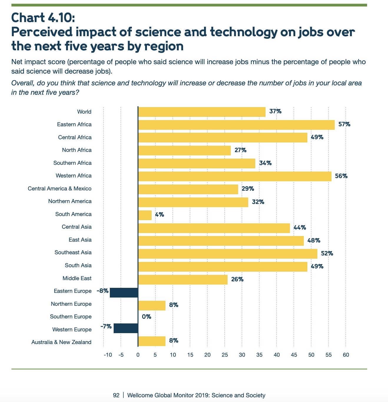This plot intends to show the net percentages of people in each global region who believe that technology will lead to an increase in jobs within their country in the next five years. Global regions are listed, as well as an average for the world. Bars are colored to indicate positive or negative net increase, and a line at `x = 0` is shown.8. List the variables that appear to be displayed in this visualization.Variables include:- Global regions- Net impact score of technology on jobs in the next five years (percentage of people who said "Increase" minus percentage of people who said "Decrease")- Positive vs Negative net percentages (color coded as <span style="color:#FFD700"><strong>Yellow</strong></span> or <span style="color:#002147"><strong>Dark Blue</strong></span>)9. Now that you're versed in the grammar of graphics (ggplot), list theaesthetics used and which variables are specified for each.- `x` is mapped to net percentage of the population in the global region that believes that jobs will increase in the next five years due to technology- `y` is mapped to the global region- `fill` is mapped to whether the net percentage is positive or negative10. What type of graph would you call this?I wold call this a horizontal bar chart. I would use `geom_bar()` to create this plot.11. List all of the problems or things you would improve about this graph. This plot is already pretty reader friendly. And I will be turning it into a map. But if I were to keep it as a bar chart, the details I would change include:- Colorizing the description so that "Increase" is <span style="color:#FFD700"><strong>Yellow</strong></span> and "Decrease" is <span style="color:#002147"><strong>Dark Blue</strong></span>.- I would remove the percentage markers at the end of each bar and make the bars hoverable so there are fewer numbers on the page.- I would make the "World" bar a different color and more prominent. I actually missed that detail the first time I looked at it.- I would include fewer x-axis labels. Every unit of 5 does not need to be included if the bars are hoverable12. Improve the visualization above by either re-creating it with the issues you identified fixed OR by creating a new visualization that you believe tells the same story better.### <span style="color:#5DC863;"><strong>Agreement</strong></span> vs <span style="color:#2C0044;"><strong>Disagreement</strong></span> that Technology Will Increase the Number of Jobs in My Country in the Next Five Years```{r}#| label: second-improved-visualizationlibrary(dplyr)library(tidyr)library(leaflet)library(rnaturalearth)library(rnaturalearthdata)library(sf)library(htmltools)# Pull just Q19 responsesq19_overall <- wgm_clean %>%filter(Question =="Q19 Overall, do you think that science and technology will increase or decrease the number of jobs in your local area in the next five years?") %>%select(Country, Response, OverallPercent =`Column N %...4`) %>%distinct() %>%pivot_wider(names_from = Response, values_from = OverallPercent)# Clean summary tableq19_final <- q19_overall %>%select(Country, Increase, Decrease) %>%mutate(Total = Increase - Decrease)# Get country centroidsworld <-ne_countries(scale ="medium", returnclass ="sf") %>%st_centroid()centroids <- world %>%select(Country = name_long, geometry) %>%st_coordinates() %>%as.data.frame() %>%bind_cols(Country = world$name_long)# Join coordinates to dataq19_geo <- q19_final %>%left_join(centroids, by ="Country") %>%filter(!is.na(X) &!is.na(Y))# Create diverging palettemax_val <-max(abs(q19_geo$Total))diverging_palette <-colorNumeric(palette =colorRampPalette(c("#440154", "#C7E9B4", "#5DC863"))(100),domain =c(-max_val *0.5, max_val))# Leaflet map (no search bar)leaflet(q19_geo) %>%addProviderTiles(providers$CartoDB.Positron) %>%addCircleMarkers(lng =~X,lat =~Y,radius =7,color =~diverging_palette(Total),stroke =TRUE,weight =1,opacity =1,fillOpacity =0.9,label =~Country,popup =~paste0("<strong>", Country, "</strong><br>","Net Agreement: ", round(Total *100, 1), "%" ) ) %>%addLegend("bottomright",pal = diverging_palette,values =~Total,title ="Net % Agreement",labFormat =labelFormat(suffix ="%", transform =function(x) 100* x),opacity =1 )```## Third Data Visualization Improvement**For this third plot, you must use one of the other `ggplot2` extension packages mentioned this week (e.g., `gganimate`, `plotly`, `patchwork`, `cowplot`).**13. Select a data visualization in the report that you think could be improved. Be sure to cite both the page number and figure title. Do your best to tell thestory of this graph in words. That is, what is this graph telling you? What doyou think the authors meant to convey with it?##### Original image (*Source: Wellcome Global Monitor, 2018, p. 98.*)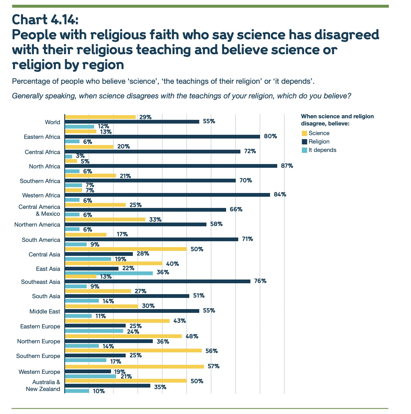This plot intends to show how people tend to resolve informational disputes between science and the beliefs of their religion. Respondents had the choice of selecting "science", "the teachings of my religion", or "it depends". Response rates are grouped by answer choice and also by geographical region.14. List the variables that appear to be displayed in this visualization.Variables include:- Percentage of people who believe science, their religion, or "it depends" when faced with an informational conflict between the two- Global region- Color-coded bars so that different responses can be easily distinguished (colored <span style="color:#FFD700"><strong>Yellow</strong></span> for "Science", <span style="color:#002147"><strong>Dark Blue</strong></span> for "Religion", and <span style="color:#00BFFF"><strong>Light Blue</strong></span> for "It depends")15. Now that you're versed in the grammar of graphics (ggplot), list theaesthetics used and which variables are specified for each.- `x` is mapped to net percentage of the population in the global region that choose to believe either science, the teachings of their religion, or "it depends" when there is disagreement between them- `y` is mapped to the global region- `fill` is mapped to the response type16. What type of graph would you call this?I would call this a horizontal grouped bar plot. I would use `geom_bar()` to create this plot, with `position = "dodge"`.17. List all of the problems or things you would improve about this graph. This plot is a little harder to look at than the previous one. Here are the changes I would make:- I would make the bars hoverable so that I can get rid of the copious percentages at the end of every bar.- I would eliminate the legend and code the colors into the title / subtitle- I would simplify the title- I would make the x-axis showing percentages for easy visual estimations, but I would have fewer grid lines18. Improve the visualization above by either re-creating it with the issues you identified fixed OR by creating a new visualization that you believe tells the same story better.## Which are you more likely to believe when there is disagreement?```{r}#| label: third-improved-visualization#| fig-width: 12#| fig-height: 17library(dplyr)library(ggtext)# Step 1: Add region labels based on country nameswgm_clean <- wgm_clean %>%mutate(Region =case_when( Country %in%c("Kenya", "Tanzania", "Uganda", "Ethiopia", "Rwanda", "Burundi") ~"Eastern Africa", Country %in%c("Chad", "Cameroon", "Central African Republic", "Democratic Republic of the Congo") ~"Central Africa", Country %in%c("Algeria", "Morocco", "Tunisia", "Libya", "Egypt") ~"North Africa", Country %in%c("South Africa", "Namibia", "Botswana", "Zimbabwe", "Lesotho") ~"Southern Africa", Country %in%c("Nigeria", "Ghana", "Senegal", "Ivory Coast", "Sierra Leone") ~"Western Africa", Country %in%c("Mexico", "Guatemala", "Honduras", "Nicaragua", "Costa Rica", "Panama") ~"Central America & Mexico", Country %in%c("United States", "Canada") ~"Northern America", Country %in%c("Brazil", "Argentina", "Colombia", "Chile", "Peru", "Venezuela") ~"South America", Country %in%c("Kazakhstan", "Uzbekistan", "Kyrgyzstan", "Turkmenistan", "Tajikistan") ~"Central Asia", Country %in%c("China", "Japan", "South Korea", "Taiwan", "Mongolia") ~"East Asia", Country %in%c("Indonesia", "Thailand", "Vietnam", "Malaysia", "Philippines", "Myanmar") ~"Southeast Asia", Country %in%c("India", "Pakistan", "Bangladesh", "Nepal", "Sri Lanka") ~"South Asia", Country %in%c("Iran", "Iraq", "Saudi Arabia", "Turkey", "Jordan", "Lebanon", "Israel") ~"Middle East", Country %in%c("Russia", "Ukraine", "Poland", "Romania", "Bulgaria", "Hungary") ~"Eastern Europe", Country %in%c("United Kingdom", "Ireland", "Sweden", "Norway", "Denmark") ~"Northern Europe", Country %in%c("Italy", "Spain", "Greece", "Portugal") ~"Southern Europe", Country %in%c("France", "Germany", "Netherlands", "Belgium", "Switzerland", "Austria") ~"Western Europe", Country %in%c("Australia", "New Zealand") ~"Australia & New Zealand",TRUE~NA_character_ ))# Build region summary with only three meaningful responsesq30_region_summary <- wgm_clean %>%filter(Question =="Q30 (If respondent believes science has disagreed with teachings of religion) Generally speaking, when science disagrees with the teachings of your religion, what do you believe? Science or the teachings of your religion?") %>%filter(Response %in%c("Science","The teachings of your religion","(It depends)")) %>%filter(!is.na(Region)) %>%group_by(Region, Response) %>%summarise(n =sum(`Unweighted Count...5`, na.rm =TRUE), .groups ="drop") %>%group_by(Region) %>%mutate(Percent = n /sum(n) *100) %>%ungroup()# ✅ Recode labels to match fill colorsq30_region_summary <- q30_region_summary %>%mutate(Response =recode(Response,"The teachings of your religion"="Religion","(It depends)"="It depends" ))``````{r}#| fig-width: 20#| fig-height: 32library(ggplot2)library(ggtext)library(plotly)# ggplot object with tooltip and custom stylingq30_hover_plot <-ggplot(q30_region_summary, aes(x = Region,y = Percent,fill = Response,text =paste0(Response, ": ", round(Percent, 1), "%") )) +geom_col(position ="dodge", width =0.75) +scale_y_continuous(breaks =seq(0, 75, by =12.5),labels =function(x) {ifelse(x %in%c(25, 50, 75), paste0(x, "%"), "") } ) +scale_fill_manual(values =c("Science"="#FFD700","It depends"="#00BFFF","Religion"="#002147" ) ) +labs(title =NULL, subtitle =NULL,x =NULL,y =NULL,fill =NULL ) +theme_minimal(base_size =14) +theme(axis.text.y =element_text(size =9),axis.text.x =element_text(size =9),legend.position ="none",plot.title =element_text(face ="bold", size =12),plot.subtitle =element_markdown(size =10),plot.title.position ="plot",panel.grid.major.y =element_blank(),panel.grid.minor.y =element_blank() ) +coord_flip()# Convert to interactive plot with custom title + subtitleggplotly(q30_hover_plot, tooltip ="text") %>%layout(margin =list(l =0, r =10, t =130, b =50),title =list(text =paste0("<span style='font-size:18px'><b>Which Are You More Likely to Believe When There is Disagreement?</b></span><br>","<span style='font-size:14px'>","<span style='color:#FFD700'><b>Science</b></span>, ","the <span style='color:#002147'><b>Teachings of Your Religion</b></span>, or ","<span style='color:#00BFFF'><b>It Depends</b></span>","</span>" ),x =0,xanchor ="left",yanchor ="top" ) )```

 This plot intends to show the net percentages of people in each global region who believe that technology will lead to an increase in jobs within their country in the next five years. Global regions are listed, as well as an average for the world. Bars are colored to indicate positive or negative net increase, and a line at